
%20(2).png?width=50&name=SA%20Logo%20Squares%20(20%20x%2020%20in)%20(2).png)
Open the door to an efficient, streamlined print process that helps your business achieve...
From Print to Fashion Merchandise: the Pantone Color Institute Changes the Game in the World of Production Printing and Branding
Pantone boasts impressive collaborations with notable brands and case studies around the world, and has brought attention to the importance of color accuracy.
Is There a Tie Between Color Accuracy and Pantone Shades?
As printing technology continues to advance, Pantone is integrating industry standards through their new Color Bridge Guide. The RGB color values are those used for screens and digital design, while CMYK values are used in printers for physical products. In CMYK printing, there are many variables of the printing process that can alter the final appearance of color. The CMYK values were previously produced manually, but the new Color Bridge Guide uses improved and exact CMYK values without manual input. This upgrade allows users to achieve accurate colors and more reliable results on a typical printer. The revamped guide will also enable users to better choose between Pantone Spot Colors or CMYK process printing. When printing the new guide, Pantone follows the G7 calibration for a consistent gray balance to ensure accurate process printing.
DOCUmation’s experts know that accuracy in printing is a direct result of printer calibration. This means we fine-tune your printer’s settings to create expected results. Some of these printer settings pertain to contrast and brightness, but the most fundamental is color. Without the correct color, branding cannot be streamlined or specific to the company’s look. Pantone uses a standardized color system where colors are identified by their own unique code. These are identified and standardized by the Pantone Matching System (PMS). By using Pantone colors and our G7 experts to calibrate your printers, we guarantee color accuracy from the start.
How Do G7 Printing Standards Affect Branding?
From iconic green revitalized to cater to the modern market, to a restaurant’s packaging, to adding a pop of color to previously mundane household appliances, Pantone understands how to define a piece of media or brand by a single identifiable color. It’s impossible to imagine established brands without a defining look, and that starts with the first thing that we see, color.
Notable Pantone Partnerships:
- Kate Spade New York’s vibrant green has been key to the brand’s success
- Crumbl Cookies recognizable, yet delectable, powdery shade of pink
- Coca Cola’s signature shade of red
Thanks to G7 calibrations, well known brands and companies can assuredly maintain their standard and continue with guaranteed identifiable branding.
“G7 compliance not only keeps all of your printers looking the best they can, it also shows potential clients, and brands, that you mean serious business,”
Brian McDaniel, DOCUmation Production Specialist
How Do Leased Printers Maintain Premium Output?
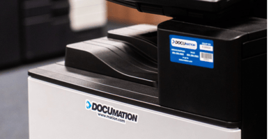
DOCUmation’s roots are in the print and copy business, and for over 30 years has remained one of our outstanding services. We provide managed print to optimize your printing fleet. Our team of master technicians and experts cover all aspects of print, from ensuring your machines are running smoothly and efficiently to managing usage and color output and quality. Finding innovative printing and color solutions is one way that DOCUmation continues to improve. G7 certification are a part of what makes our business and quality the best in Texas. DOCUmation printers and technology are backed by our experts to help you maintain premium output and understand the importance of consistent results, and here at DOCUmation we carry out your business needs to make it happen.

.jpg?height=200&name=Secure%20Printing%20%20(1).jpg)